SNKRS.jjj
SNEAKERS, TO ME, HAVE NEVER BEEN ABOUT THE HYPE OR ABOUT WHAT’S CURRENTLY COOL AND RESELLING FOR THOUSANDS. LET’S BE CLEAR… I AM NOT A SNEAKERHEAD & I WILL NEVER PRETEND TO BE. I CAN’T REMEMBER THE NAMES OF ANY SHOE AND BASKETBALL CULTURE IS SO FAR FROM ANYTHING I CAN COMPREHEND LOL. BUT I LOVE SNEAKERS. I’VE ALWAYS SEEN THEM AS TINY HOUSES AND TINY SCULPTURES FOR OUR FEET. BACK IN COLLEGE I WOULD FANTASIZE ABOUT BEING A SNEAKER DESIGNER; CLEARLY I TOOK A DIFFERENT ROUTE BUT IT’S STILL SOMETHING I ENJOY THINKING ABOUT! THIS SERIES WILL CONTINUE TO EVOLVE OVER TIME AND I WILL CONTINUE TO PUSH EACH PIECE TOWARDS A MORE TACTILE EXPERIENCE. SHOP PRINTS HERE
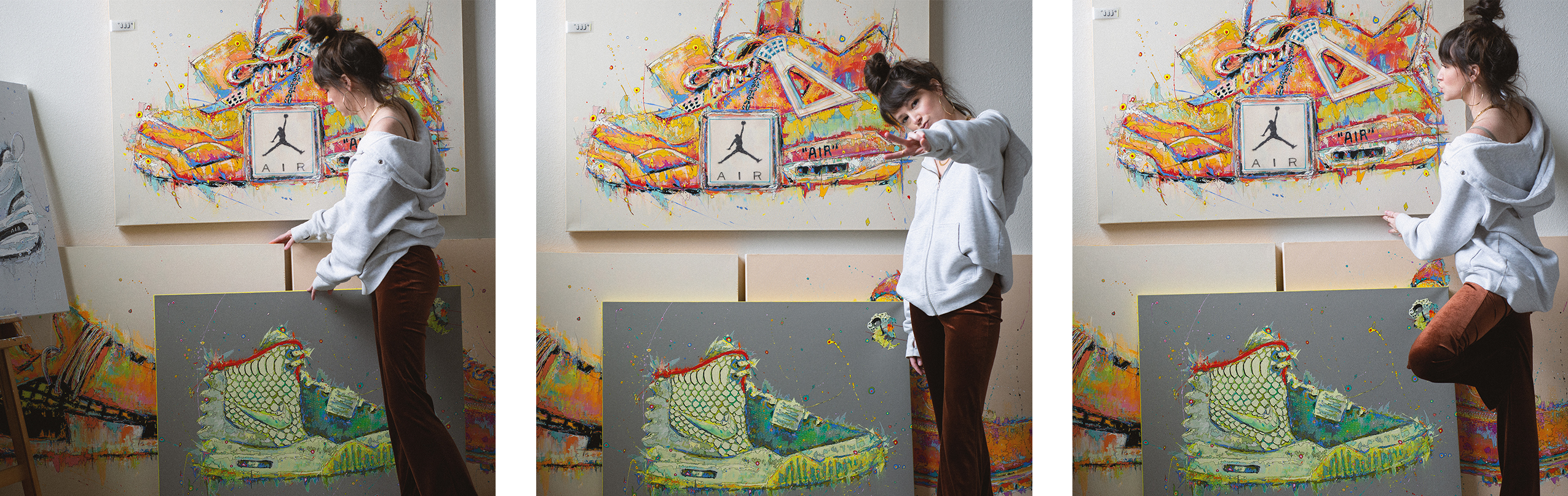
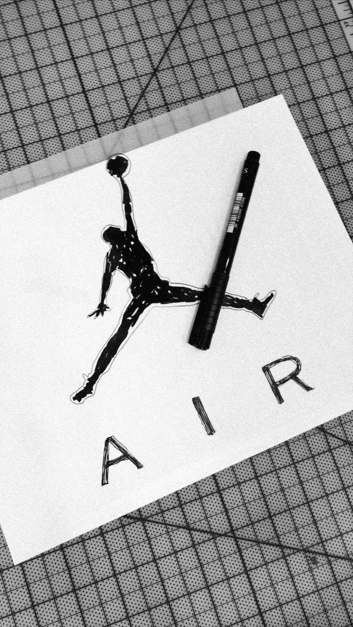
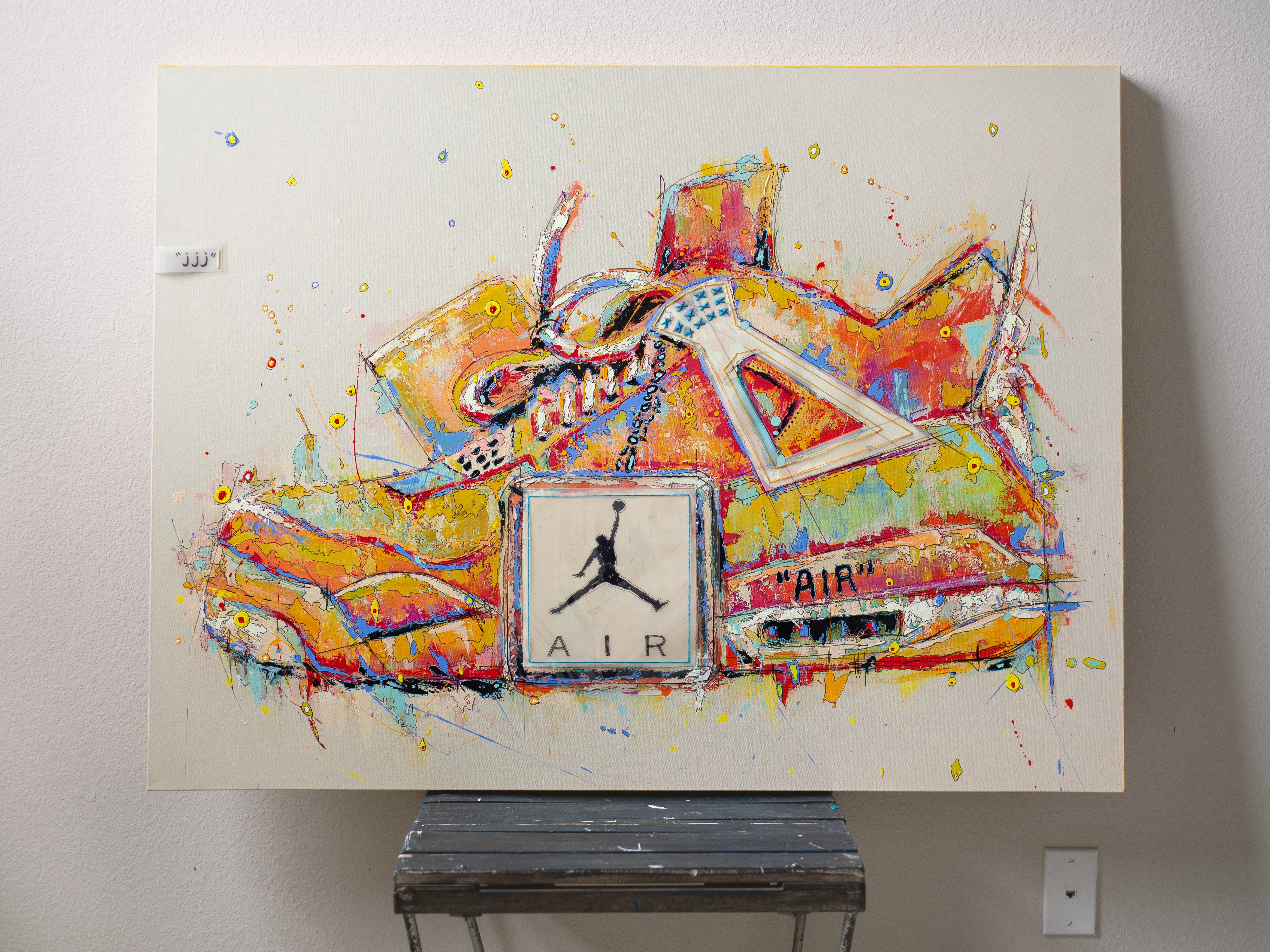
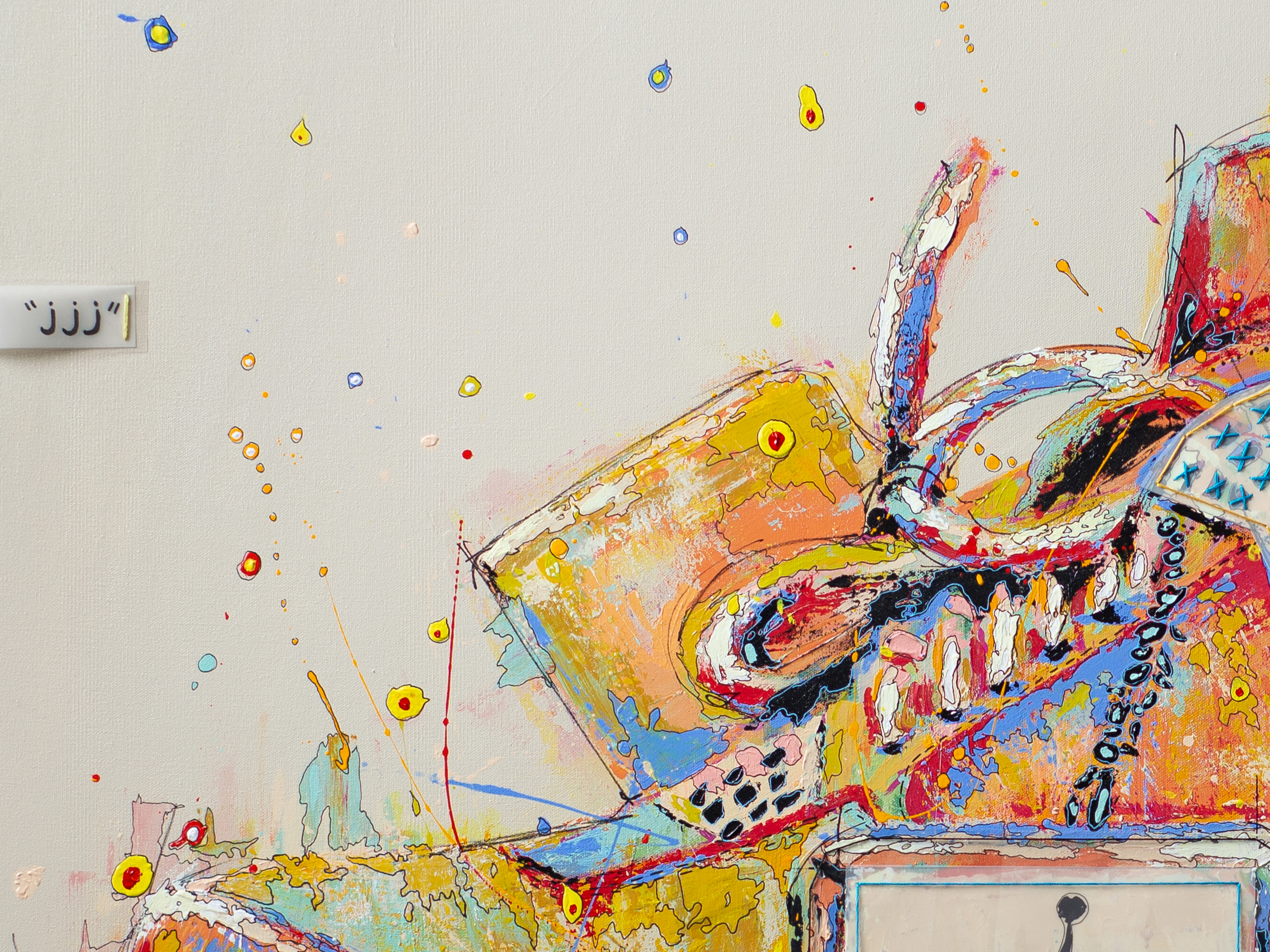
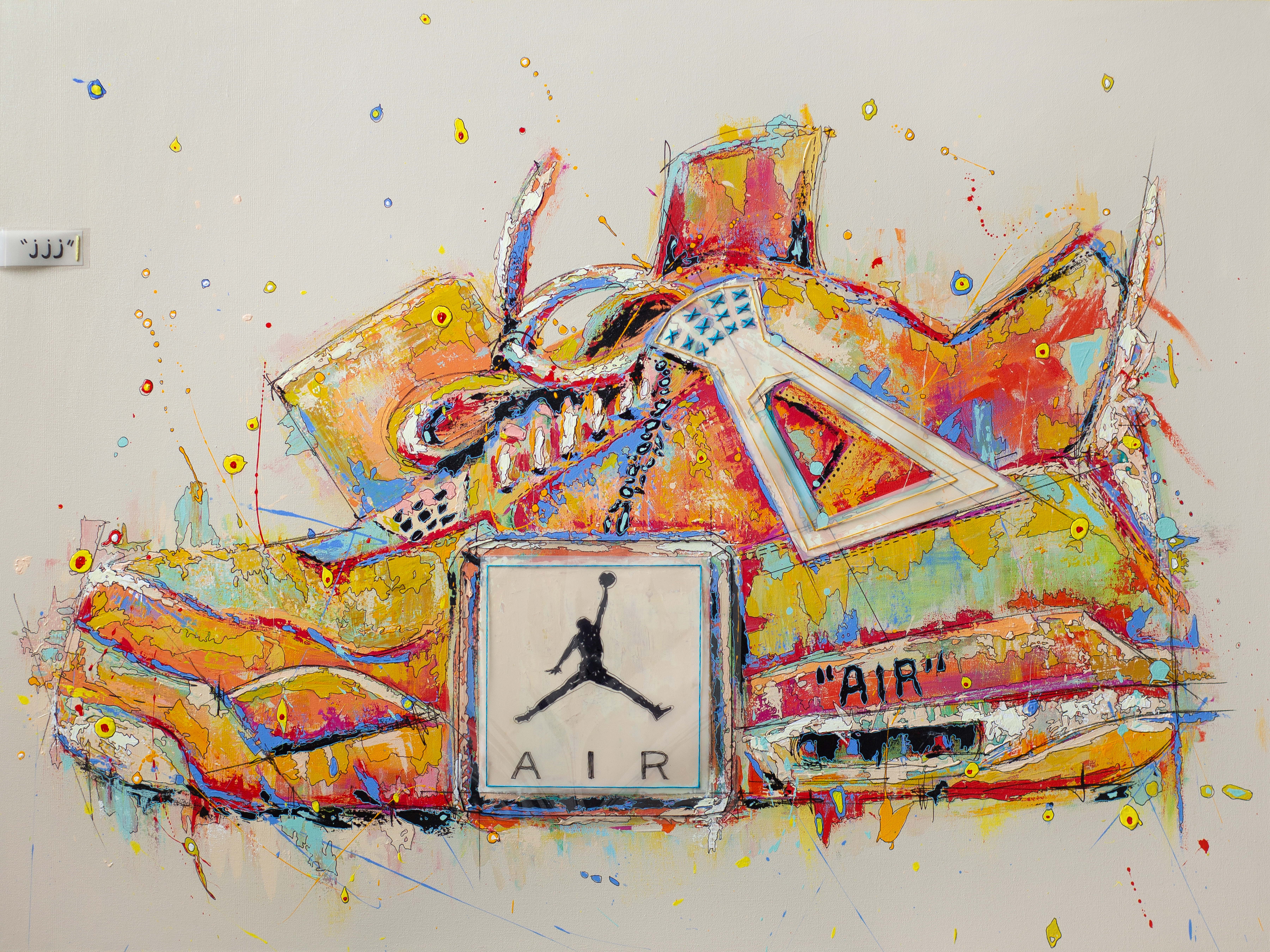
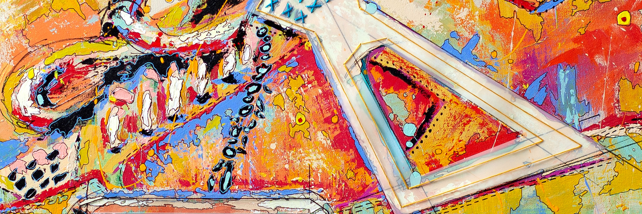
OFF-WHITE X AIR JORDAN 4 “SAIL”
This is, both, my favorite sneaker of all time & my favorite painting I’ve made of all time. I really wanted to pay homage to the design process through an architectural lens. I used clear mylar to be stitched on as the Jordan hang tag and used a matte tracing paper for the support wing. The support wing or lace tab, which ever name your prefer, always reminds me of a speed square so I knew I wanted to get technical with the details! I really went back to my design school days while painting this one and it inspired me to start adding material to each sneaker moving forward.

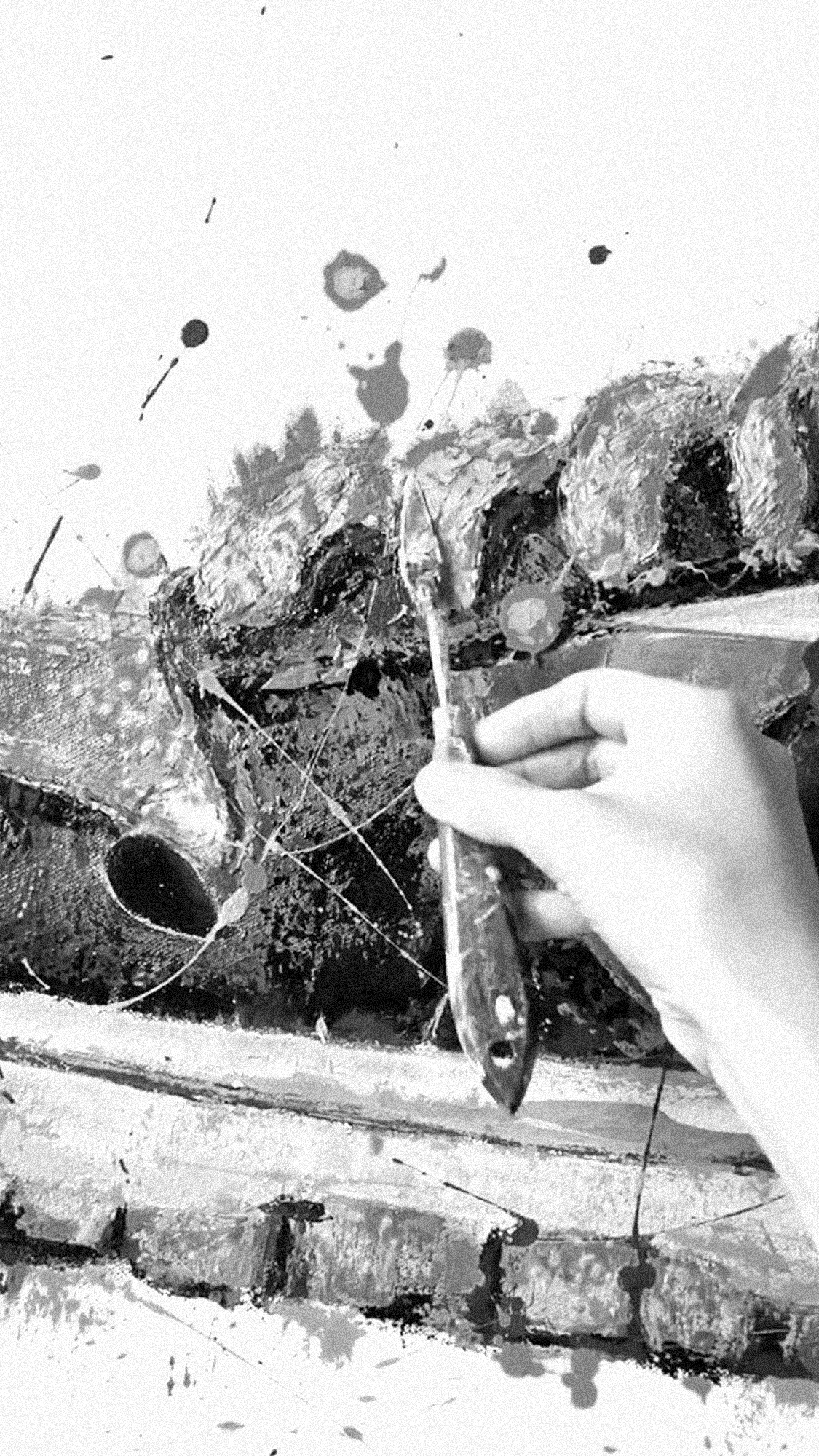
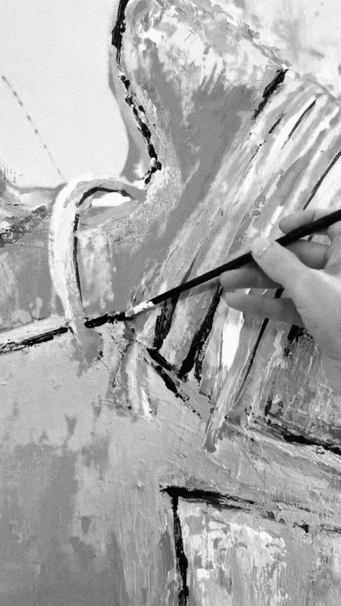
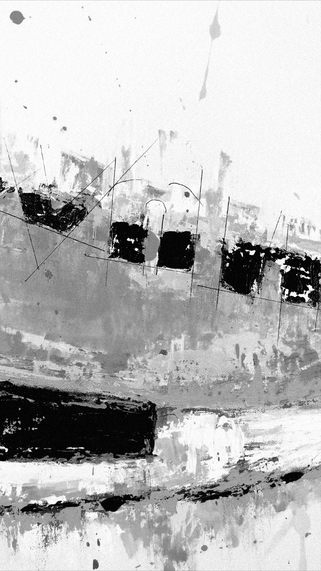
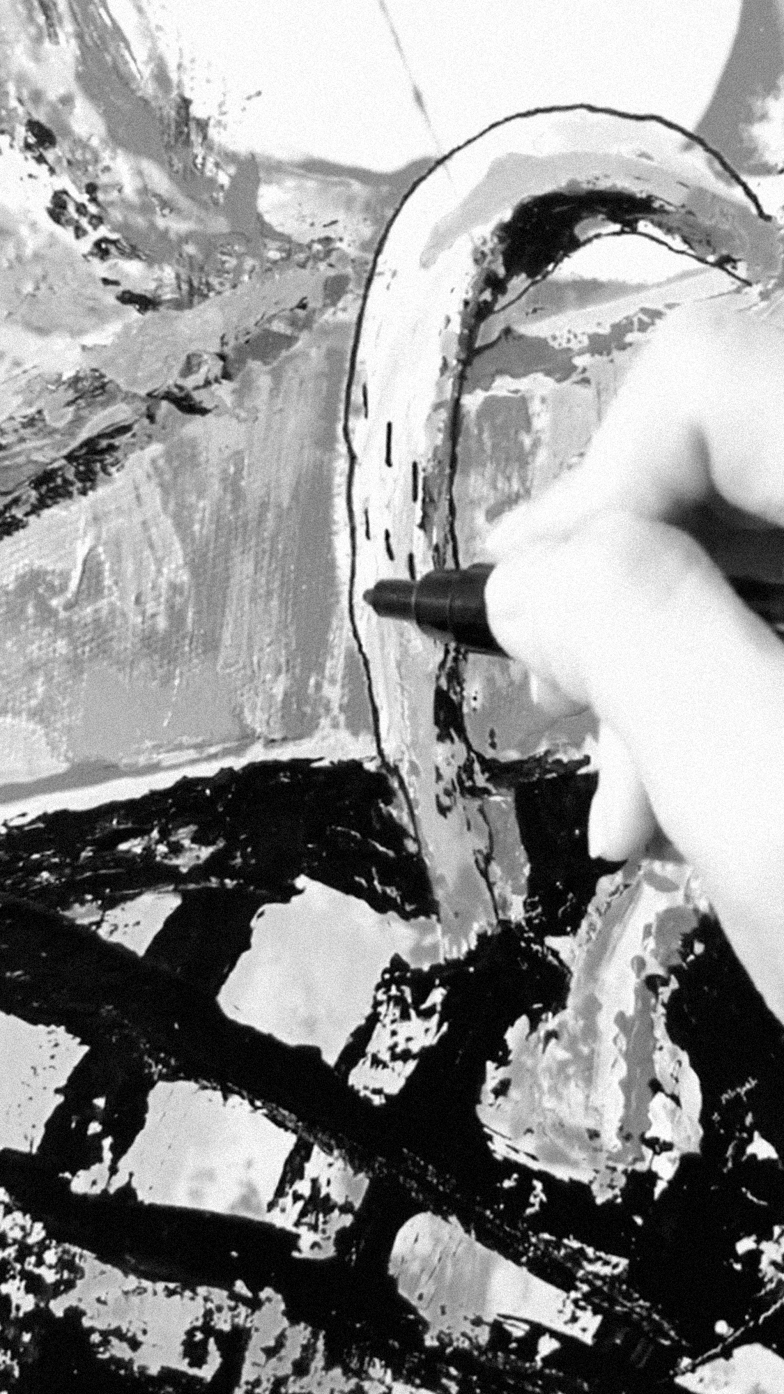
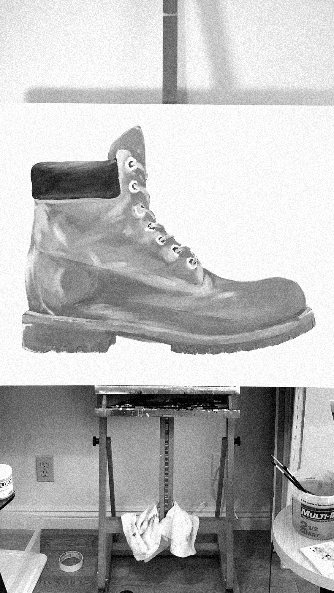
Photos straight from the IG Story. I usually post my progress as I go.


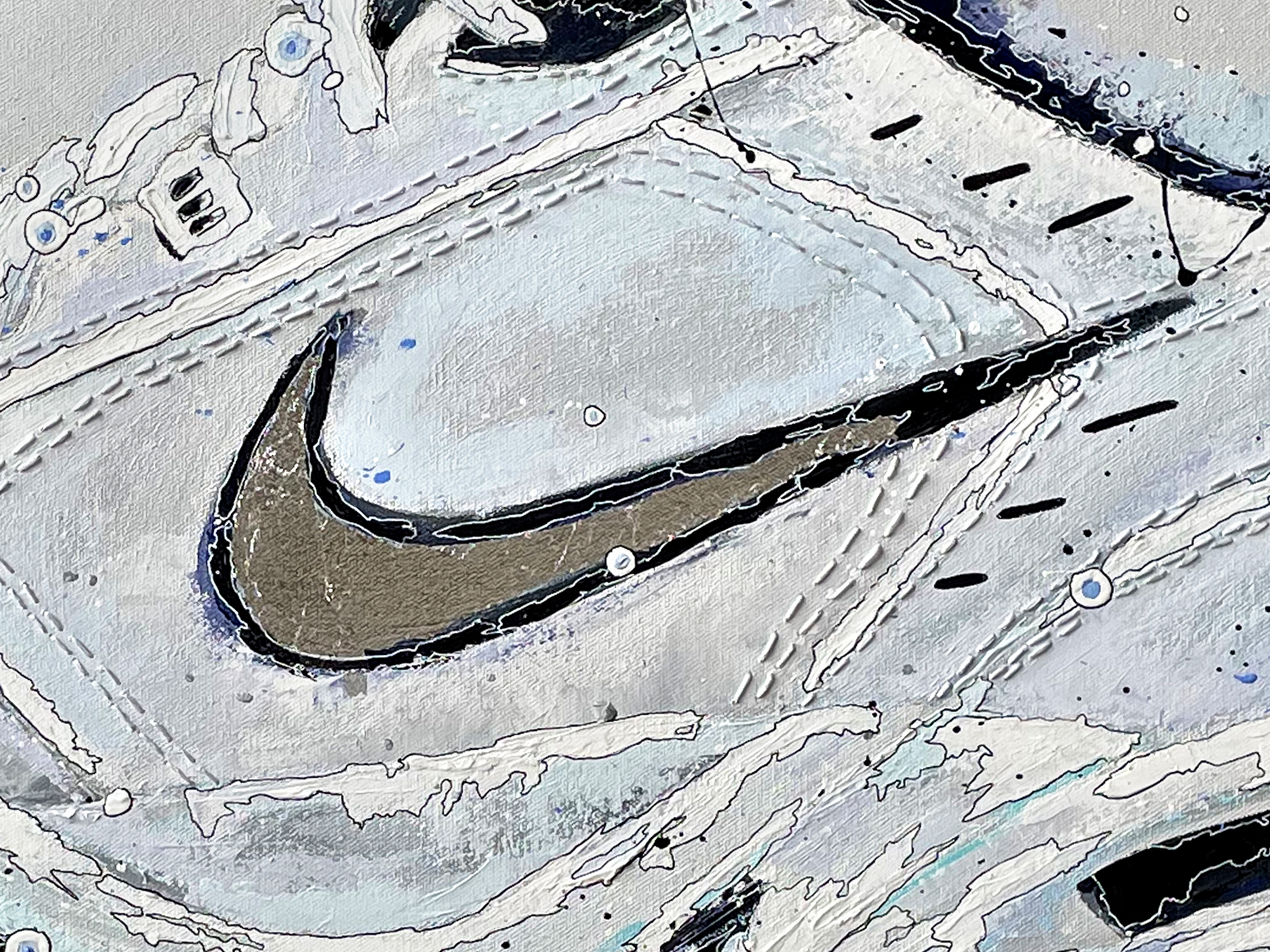
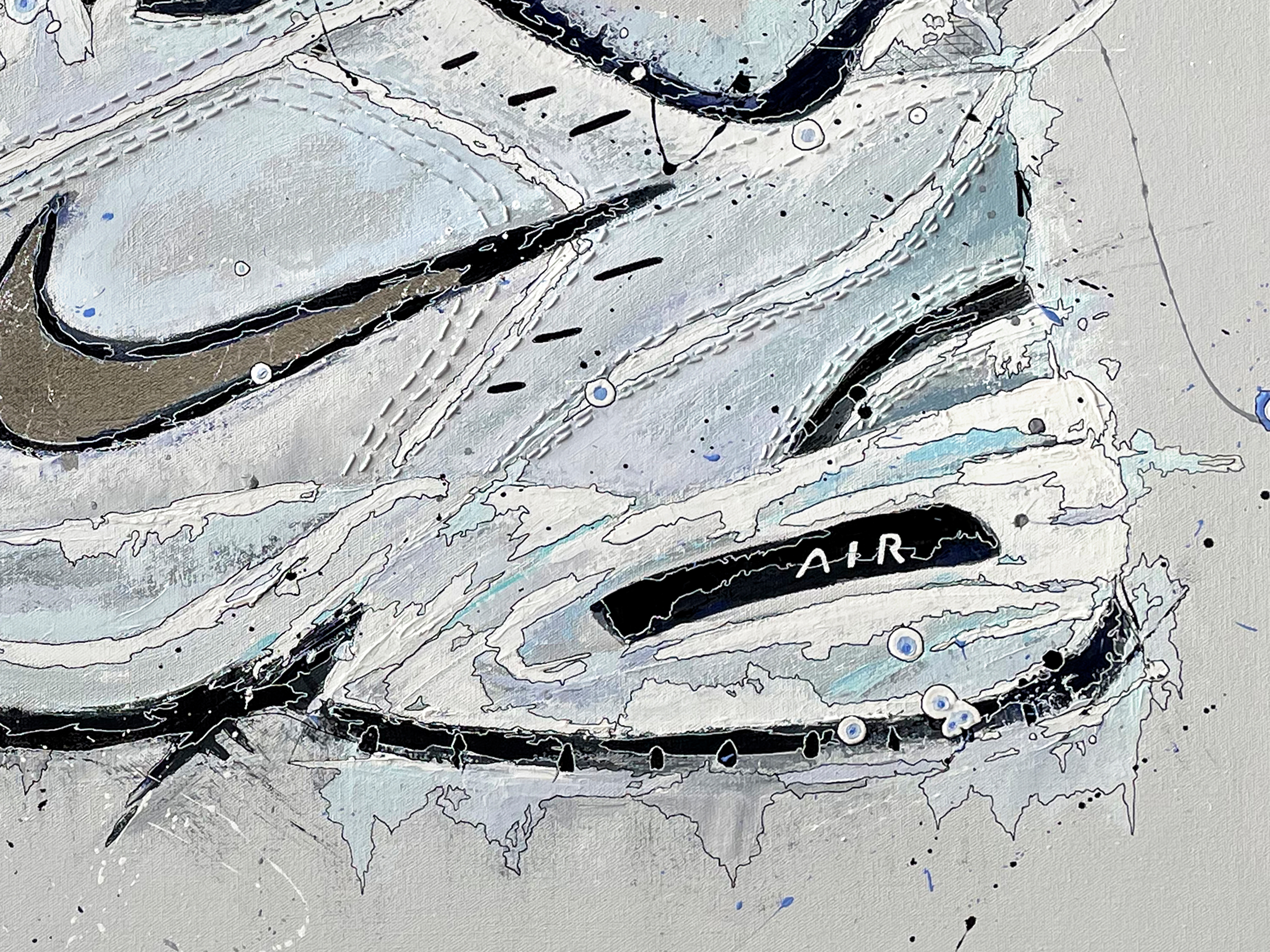
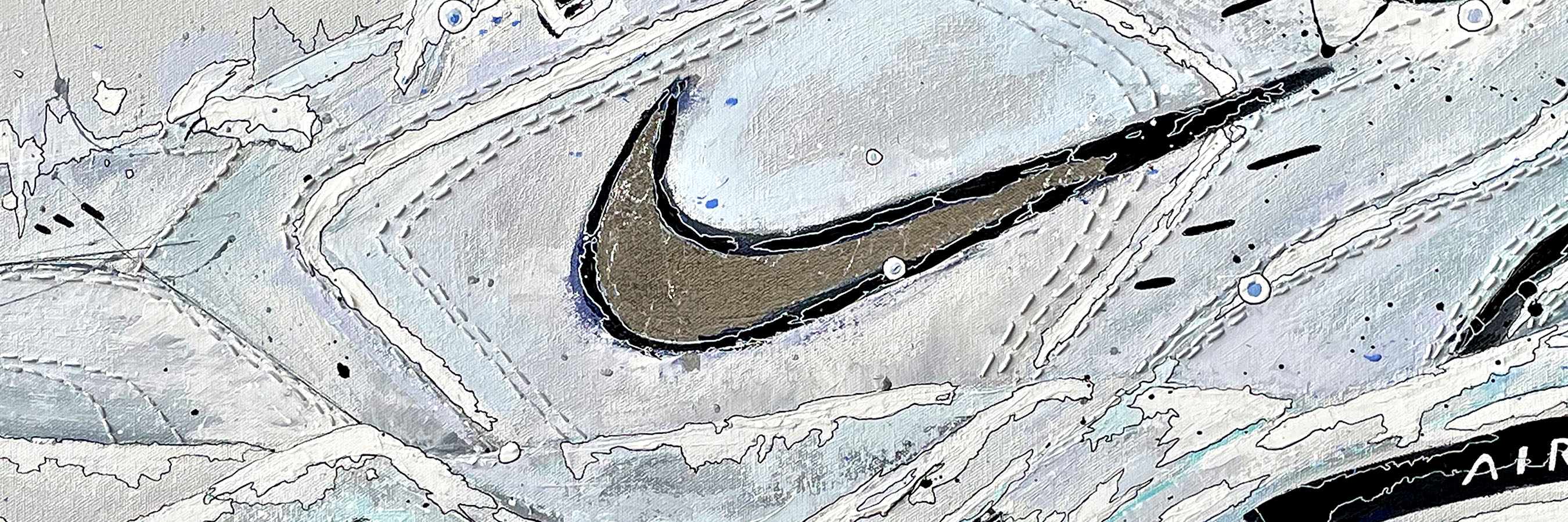
NIKE MONARCH
The Monarch was a special one because it was a piece created for someone who designs at nike and had recently lost her father. The Monarch was the sneaker that the two of them bonded over and would forever be a symbol of their relationship. Some paintings are frustrating to complete, for many reasons, but this one came together so peacefully. I made sure to only listen to 80’s metal rock while painting it to channel her dad’s essence. It came out so simple, refined, and clean. i used metal leaf for the swoosh and hand-stitched most of the seams throughout.


Metal leaf for the swoosh and all of the shoe seams stitched by hand.


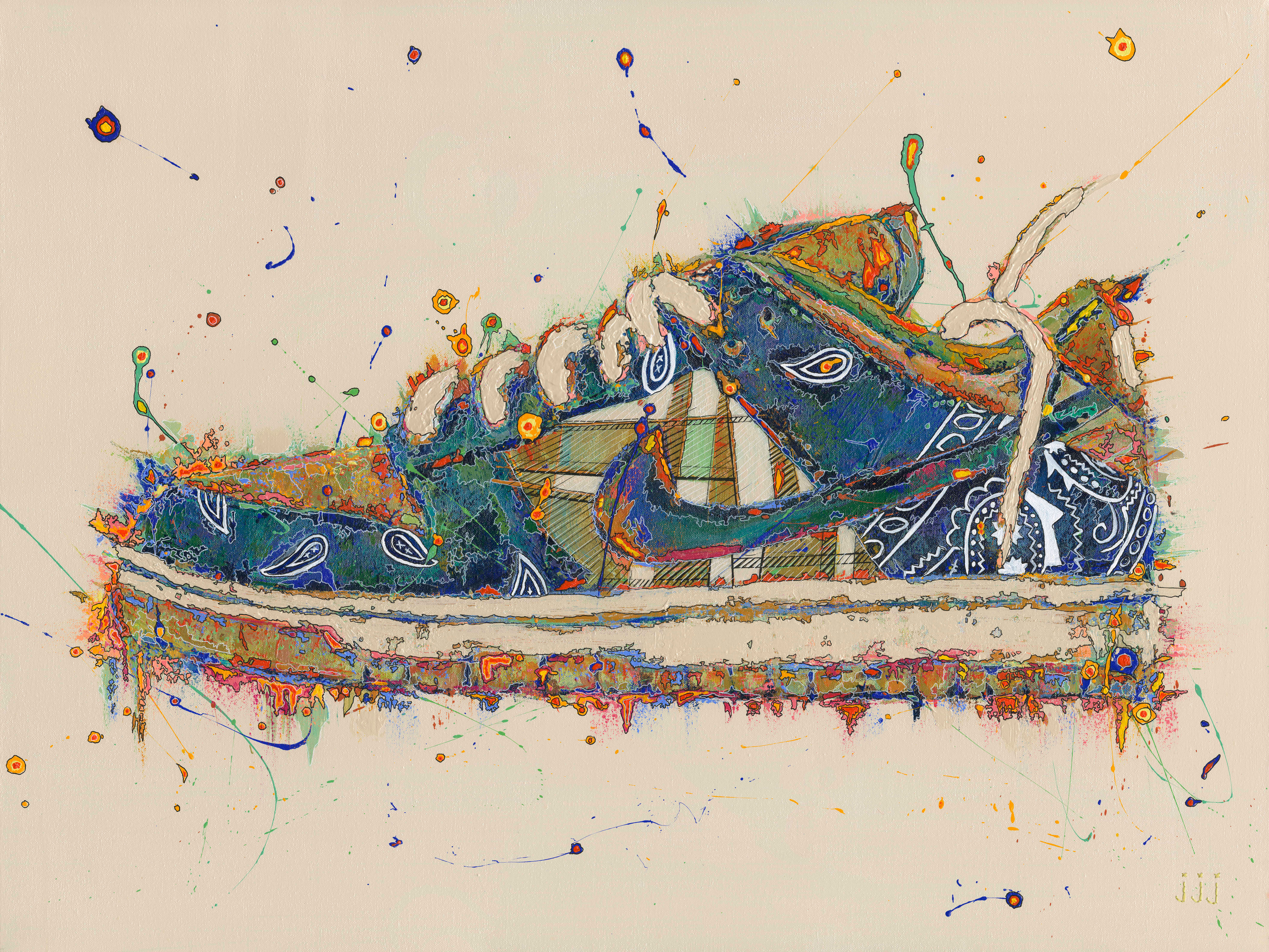
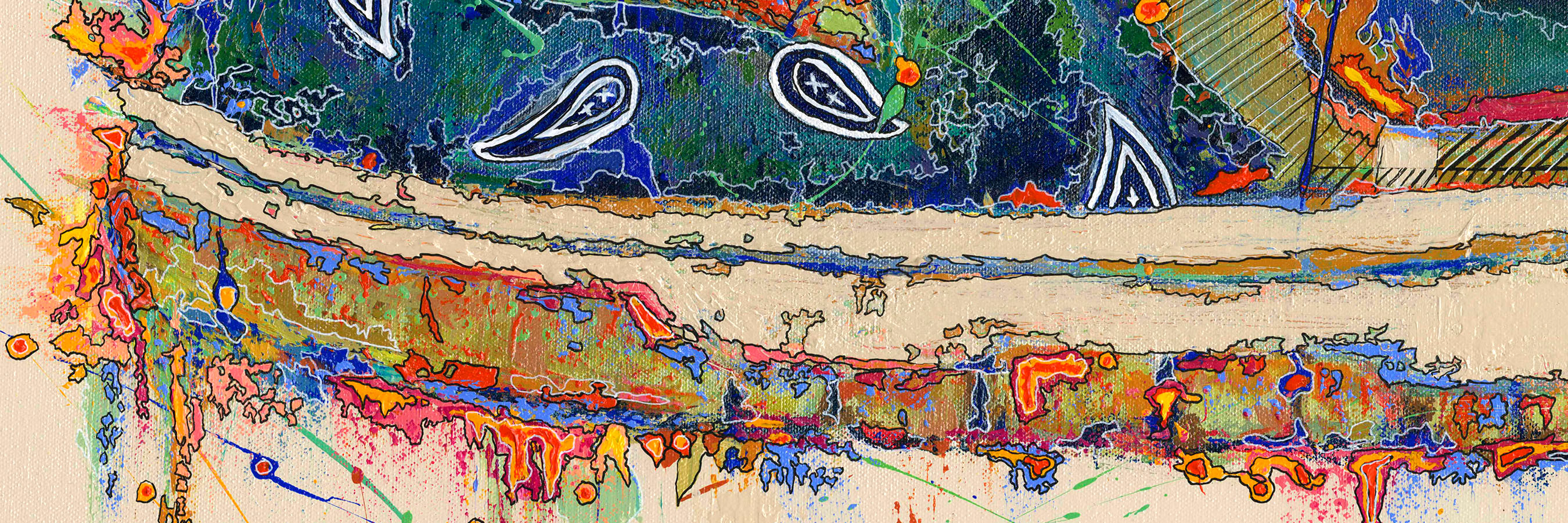
TRAVIS SCOTT X NIKE DUNK SB
This was a really fun commission that i got to do back in 2021. I’ve always been a fan of Travis Scott’s music & especially the overall creative direction of his brand, so I was excited when this request came in. This was the first sneaker I painted that had a pattern design on the OG, so recreating that in my own way was fun and a challenge. It ended up creating so much dimensionality and I was happy with the final product. The stitching, on this piece, was left to the “jjj” signature on the bottom right.

Hand stitched “jjj” and lots of paint pen detail for the patterns.


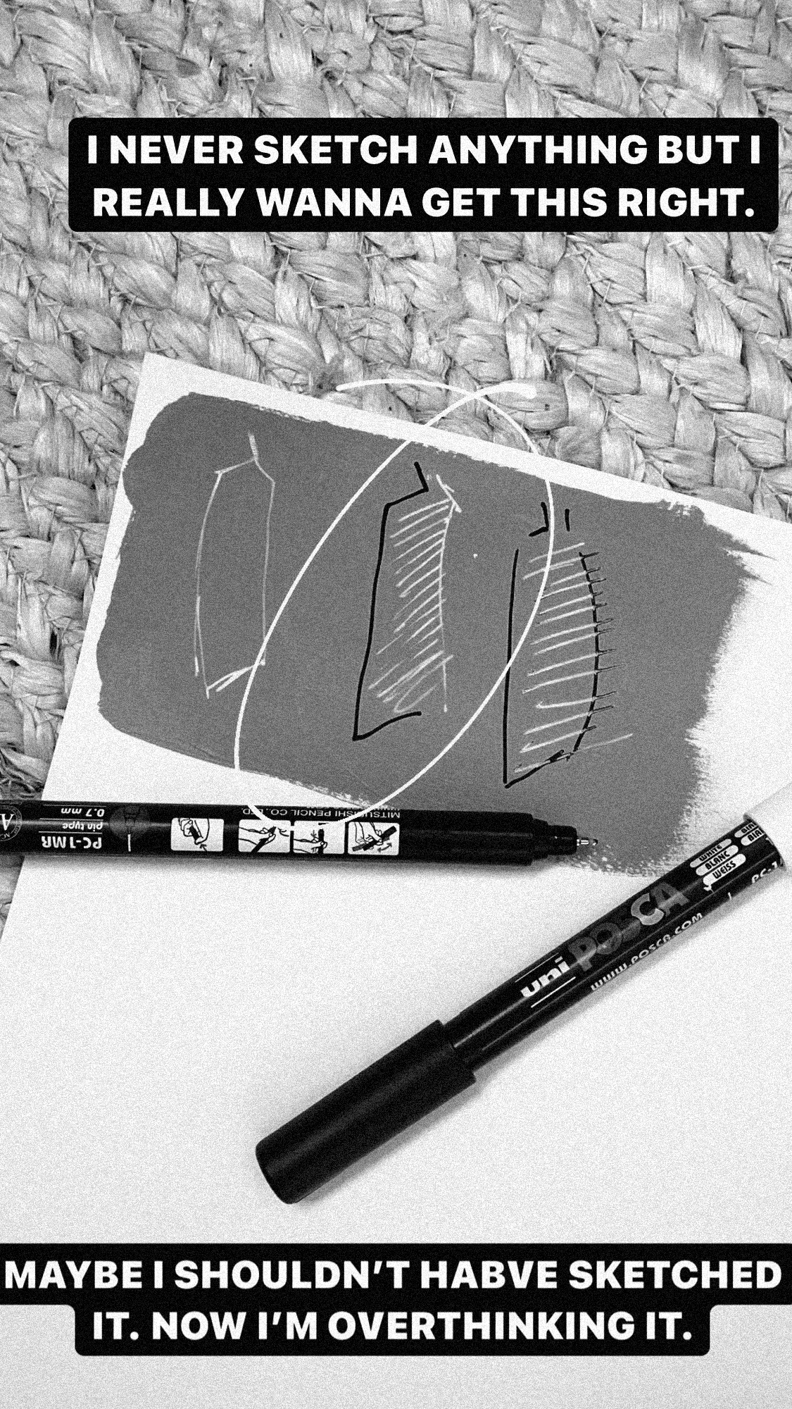
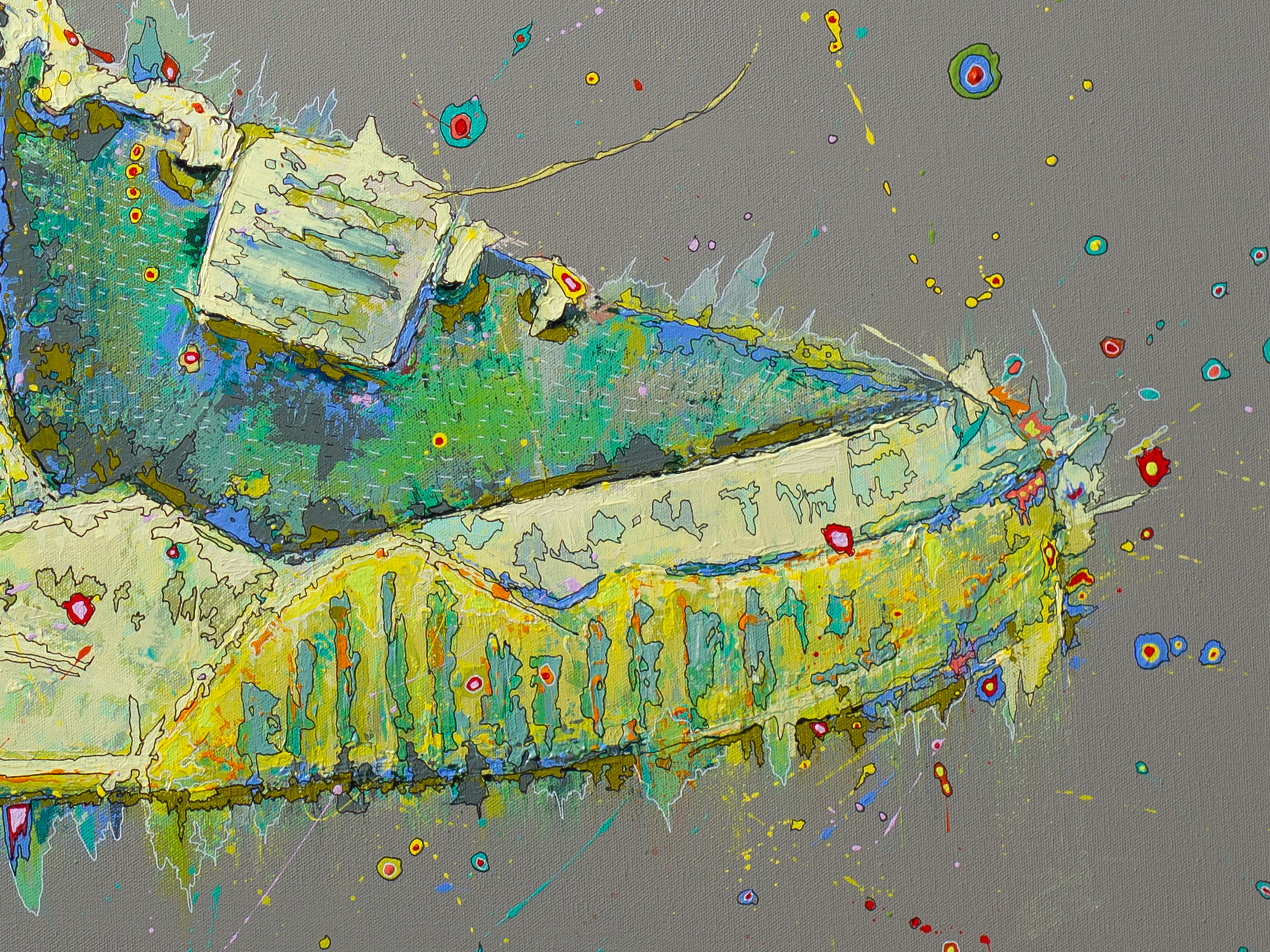
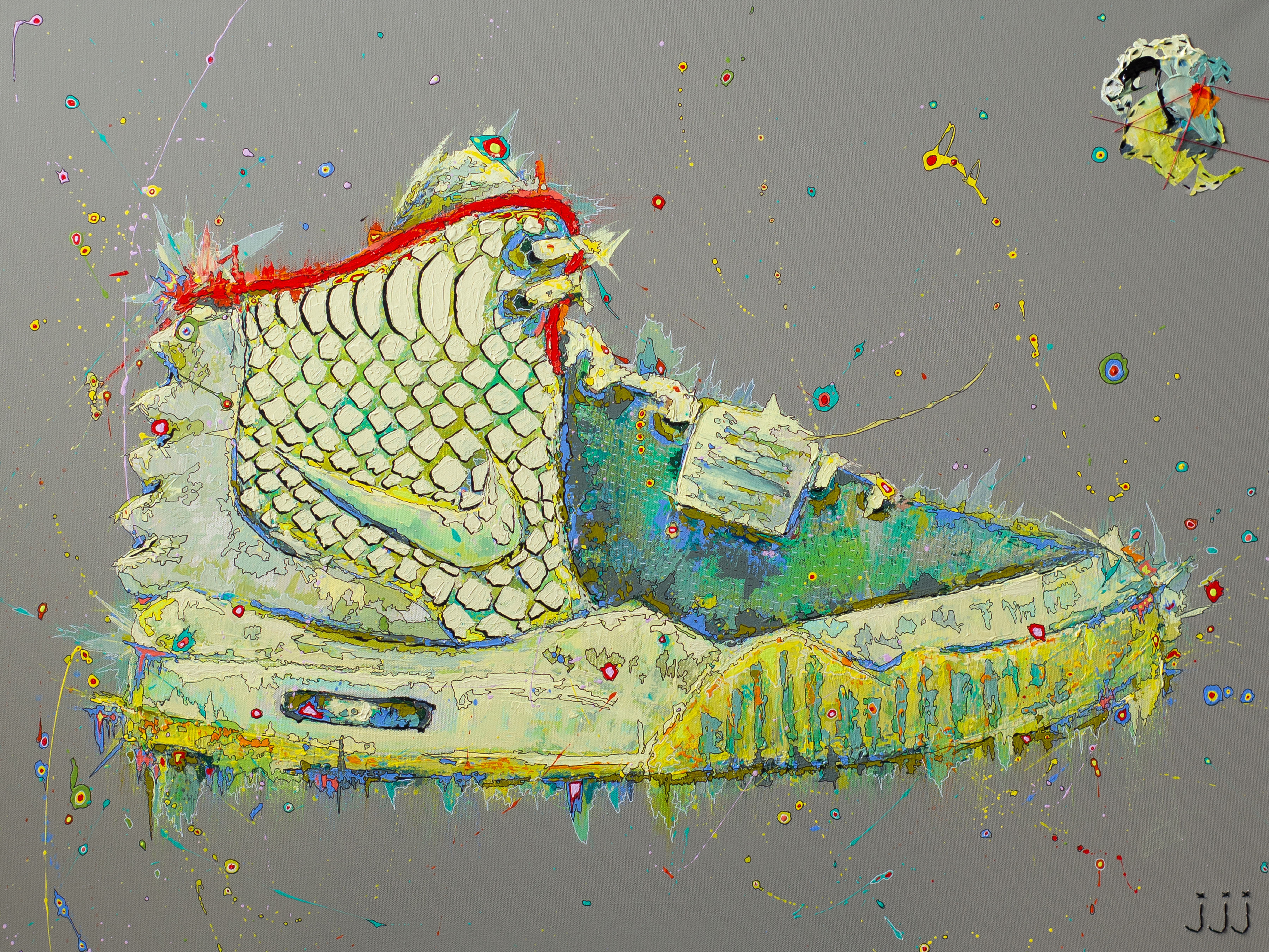
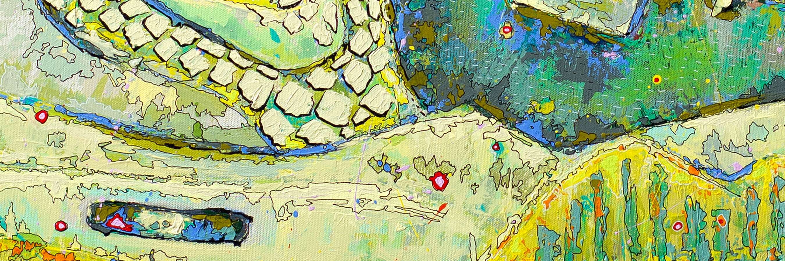
AIR YEEZY
The Red October was, and is, my favorite Yeezy of all time (to no surprise, not a very unique take) but the Pure Platinum is my second favorite. I painted this one because I wanted to take on the challenge of the snake skin. Originally, I had the plan to hand stitch the texture, which I did, unsuccessfully. It ended up being the most obvious element on the canvas, when really it should be a second read. So, I took some time to sketch out the execution and decided that it would be a palette knife and ink pen approach. I love the idea of showing the actual process of the painting on the painting itself, so I stitched on part of the paint palette that I used on the upper right corner. This is something I did with the very first sneaker I painted, the Converse, but I didn’t attach it properly so naturally with time it got lost.
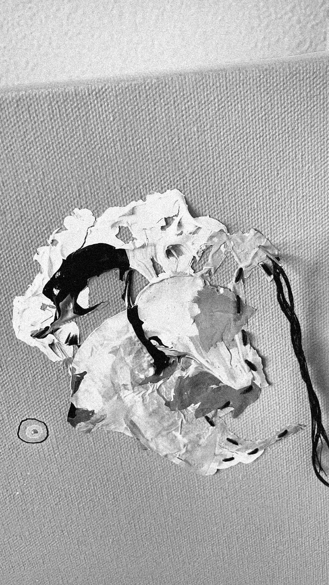
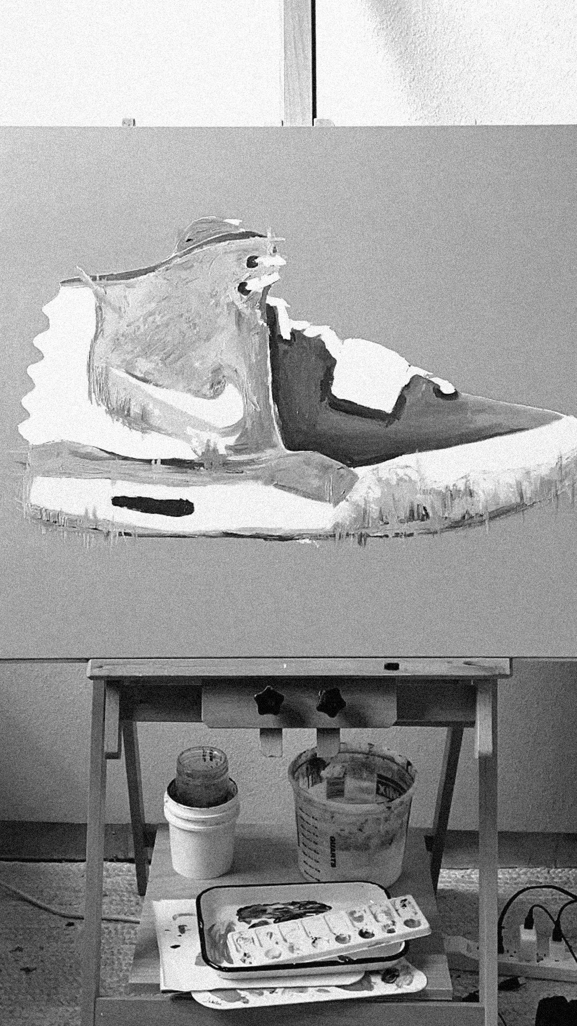
Paint palette sitched on for “proof of work” and sketches of how to execute the texture.


ADIDAS HU NMD
I’m a huge fan of the Human Race brand, both aesthetically and the intent behind the brand itself. The OG yellow HU NMD has been my favorite of the line because I just feel like “human race” on the top of the sneaker was so impactful and had such great double meaning. This was the second sneaker painting I created in this series (not including a Yeezy that was a total flop, but great exploration) and the first painting that I ever gridded out before starting. I used to think that gridding out art was cheating, don’t even get me started on using a projector, but quickly learned that I saved so much money on paint by actually just planning out the piece first. I hand-stitched the laces and added in some blueprint lines to push the planned-out nature of this one.
*No shade to anyone using a projector… I will absolutely in time switch to that method, I’m just not ready to give up the ‘getting to know you stage’ of starting a painting.
Hand stitched laces with sharp, blueprint style lines throughout.


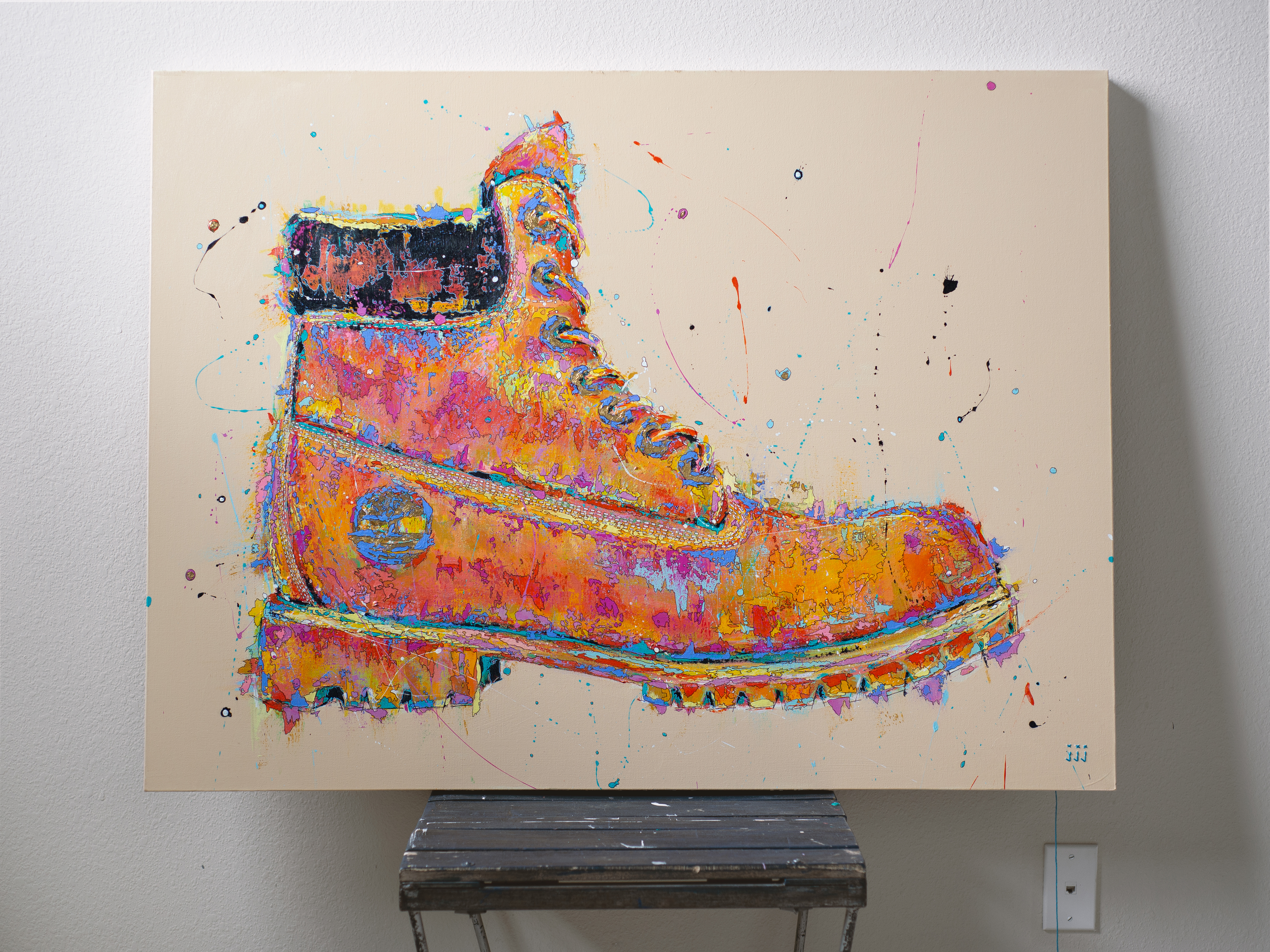
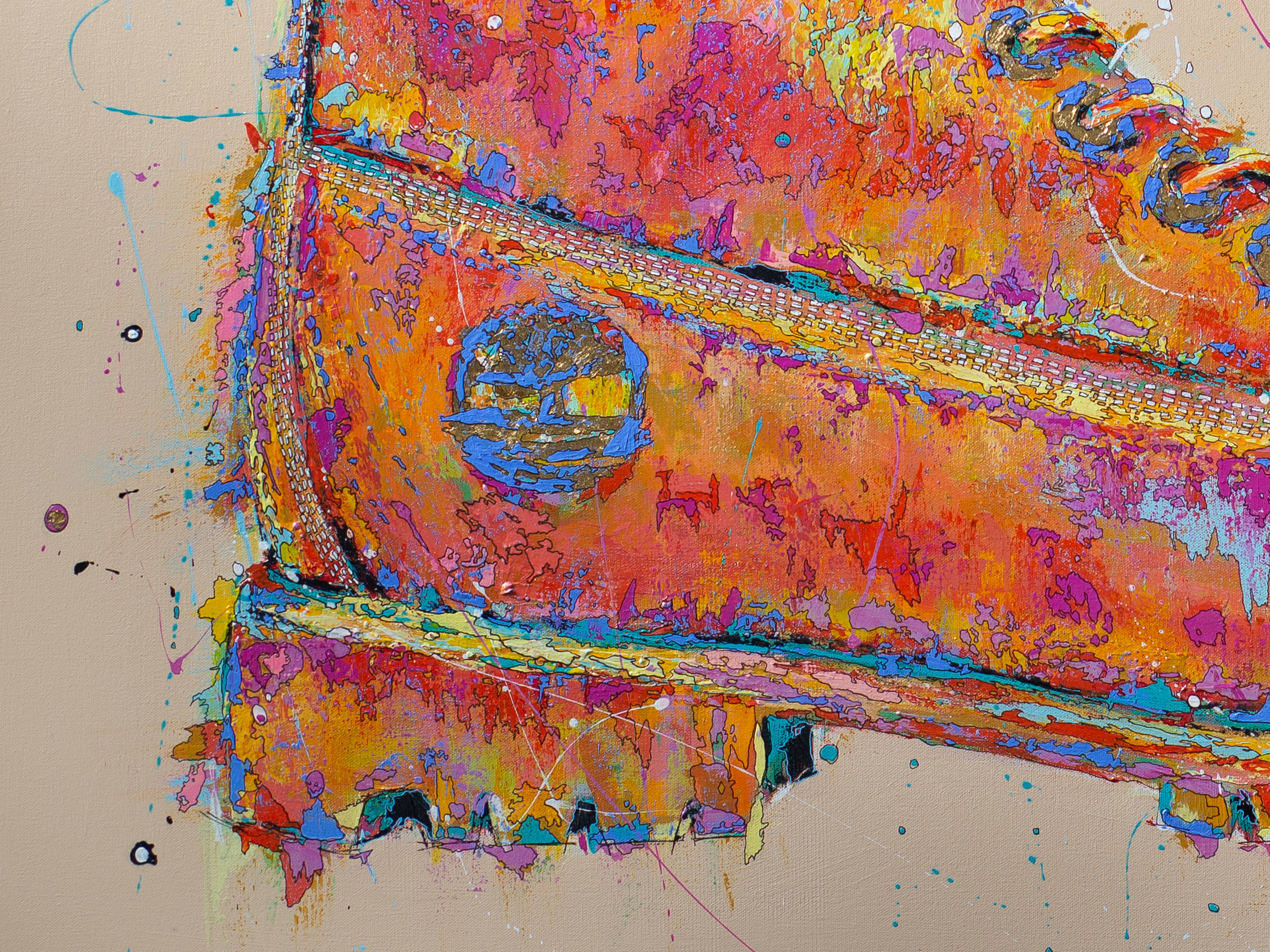
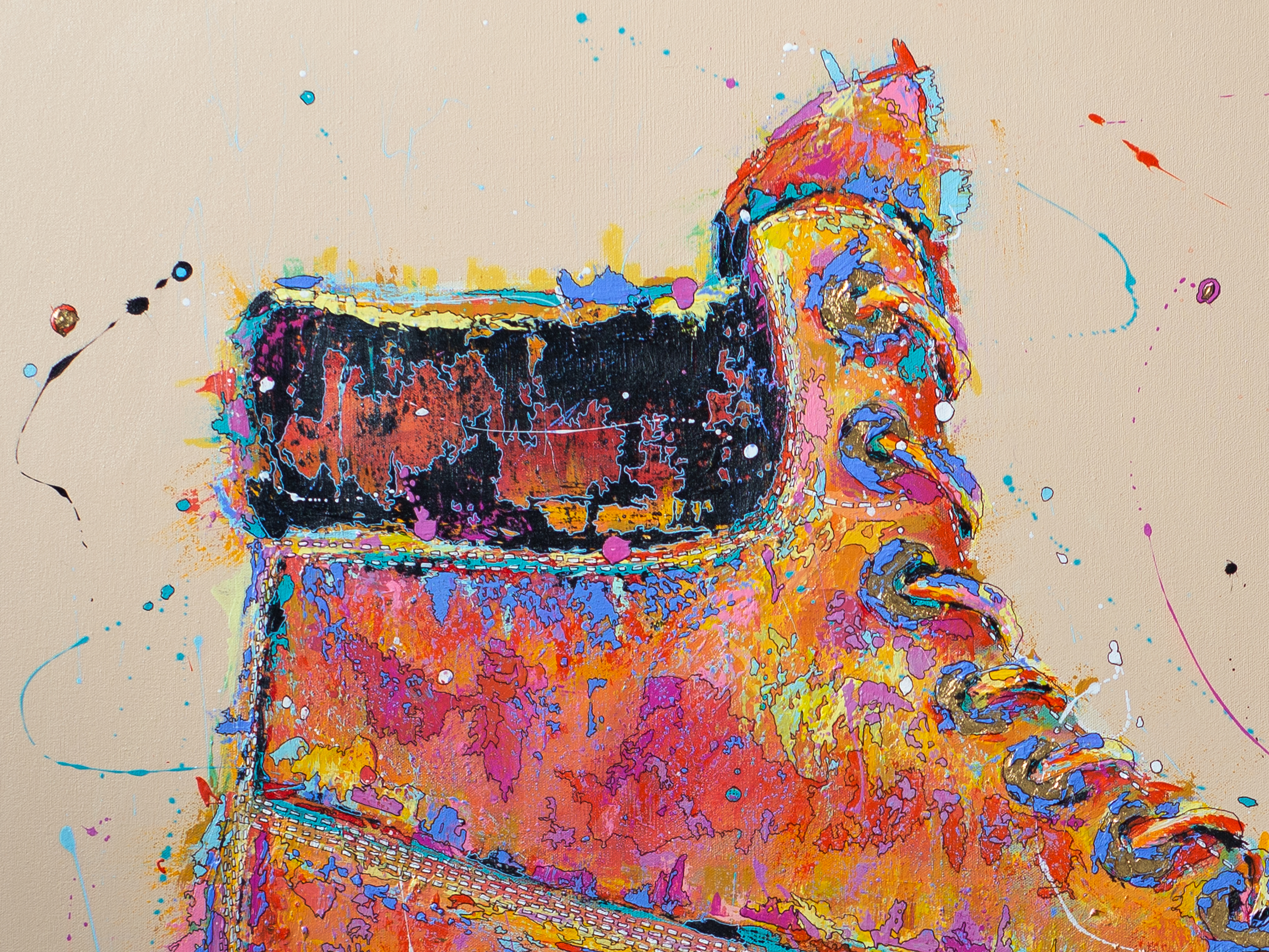
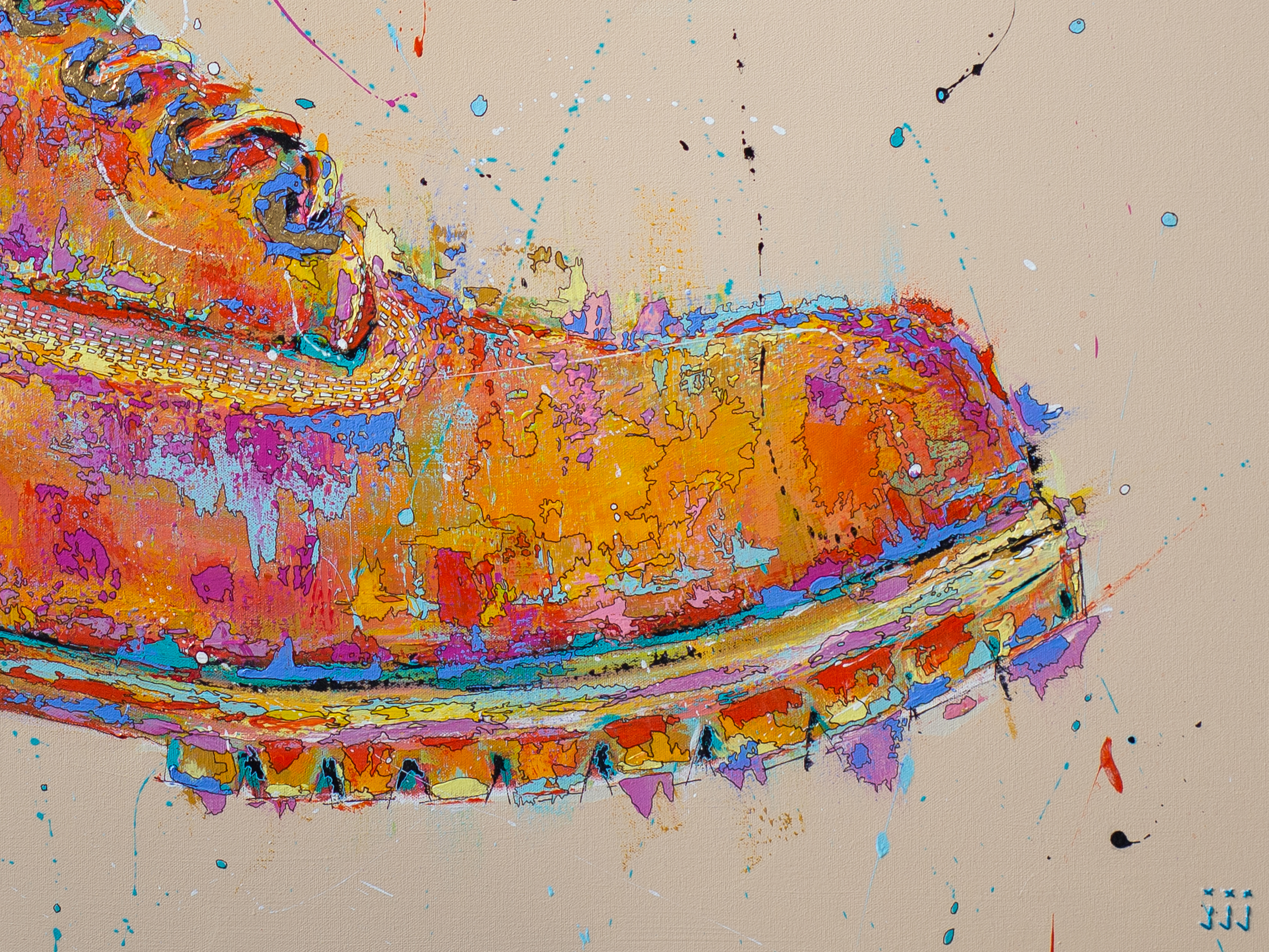
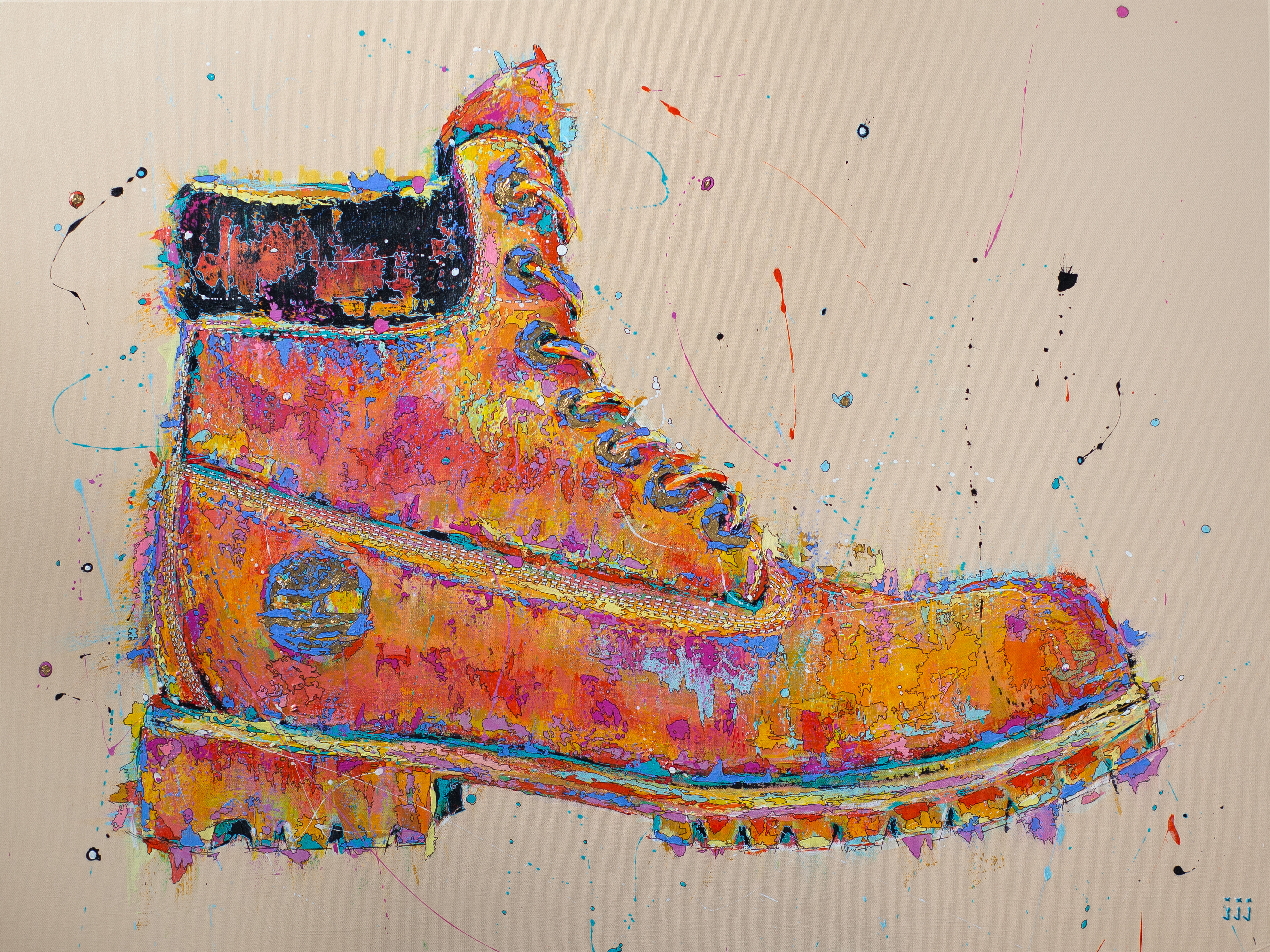
TIMBERLAND
The Timberland was kind of an homage to my home in Minnesota and also my first attempt with gold leaf on a painting. While I do look at this painting and think it’s executed well, there are things I would have done differently and maybe some things I would have taken a bigger chance on. To me, there’s nothing wrong with it at all but there’s also nothing hugely compelling about it, either? It’s a good painting. It got the job done. And I love my Timbs.
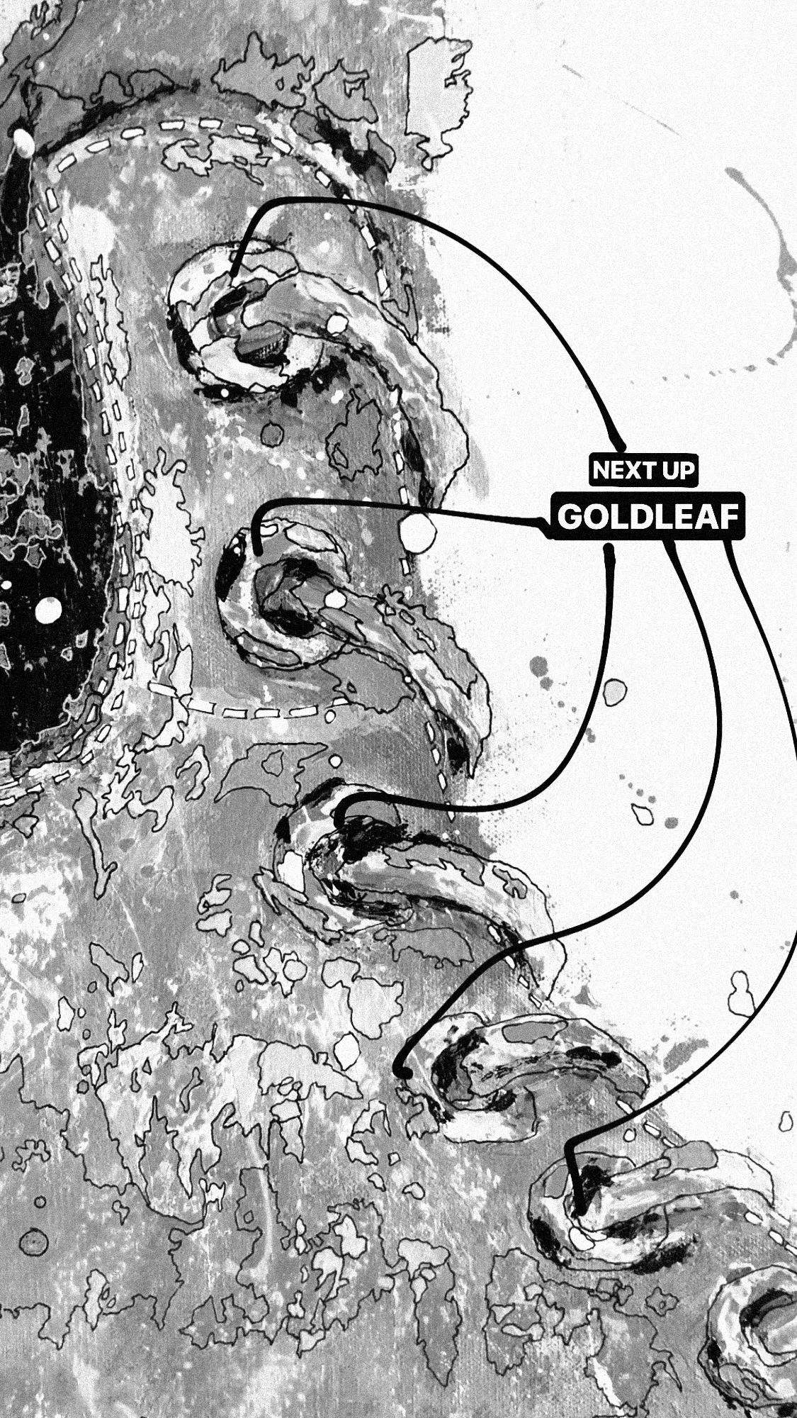

Gold leaf for the eyletes and gold leaf for the logo.

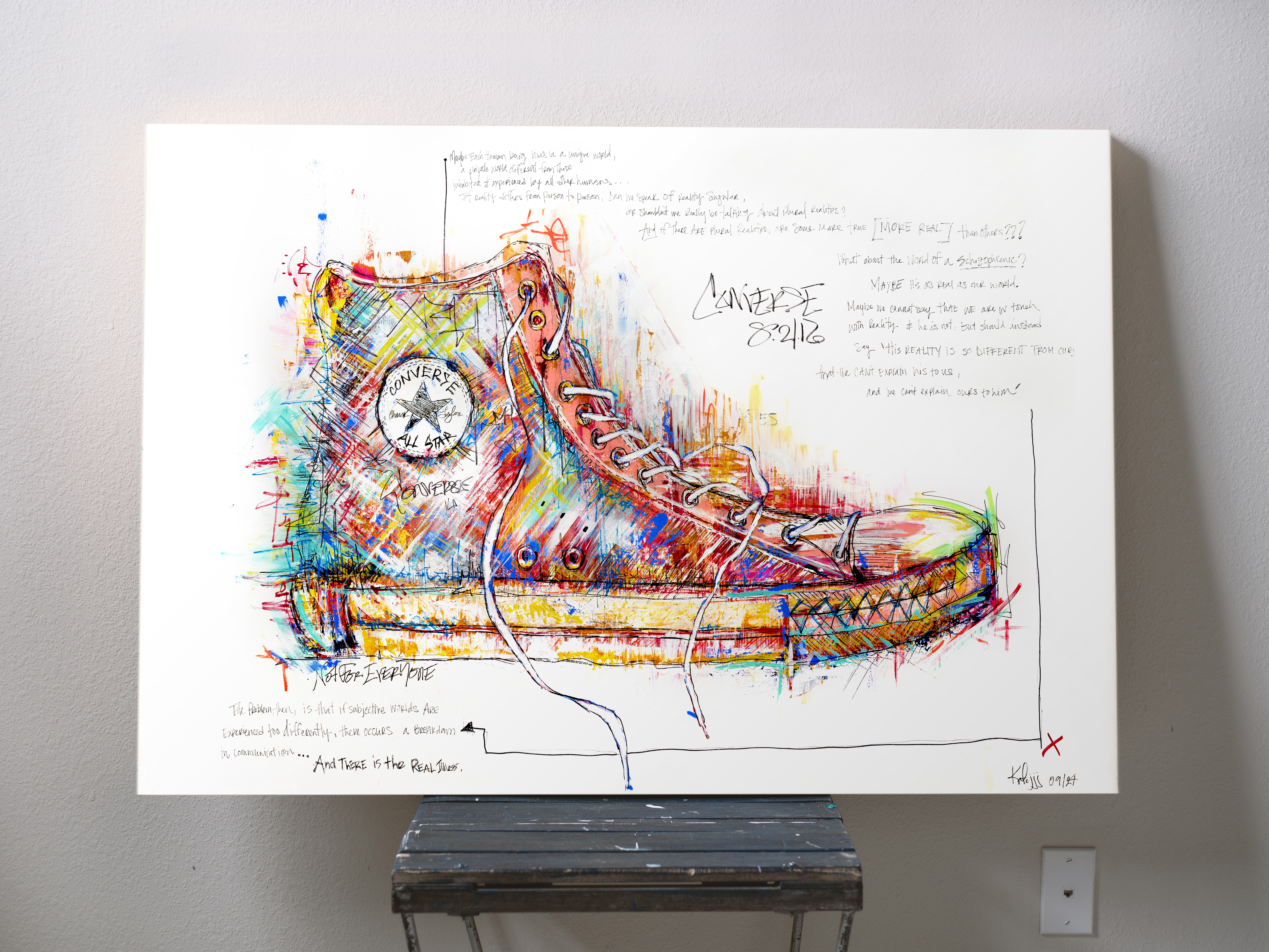
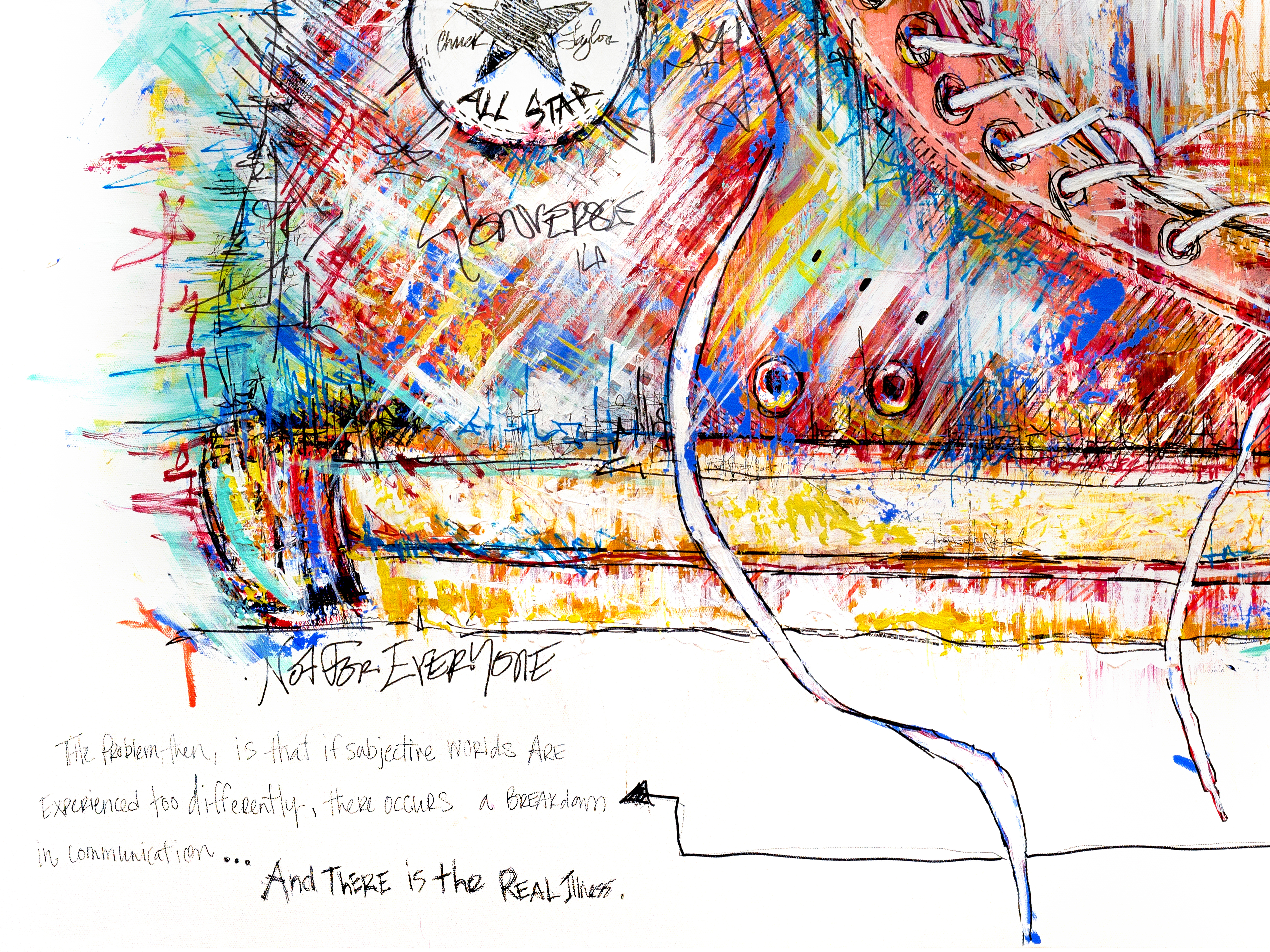
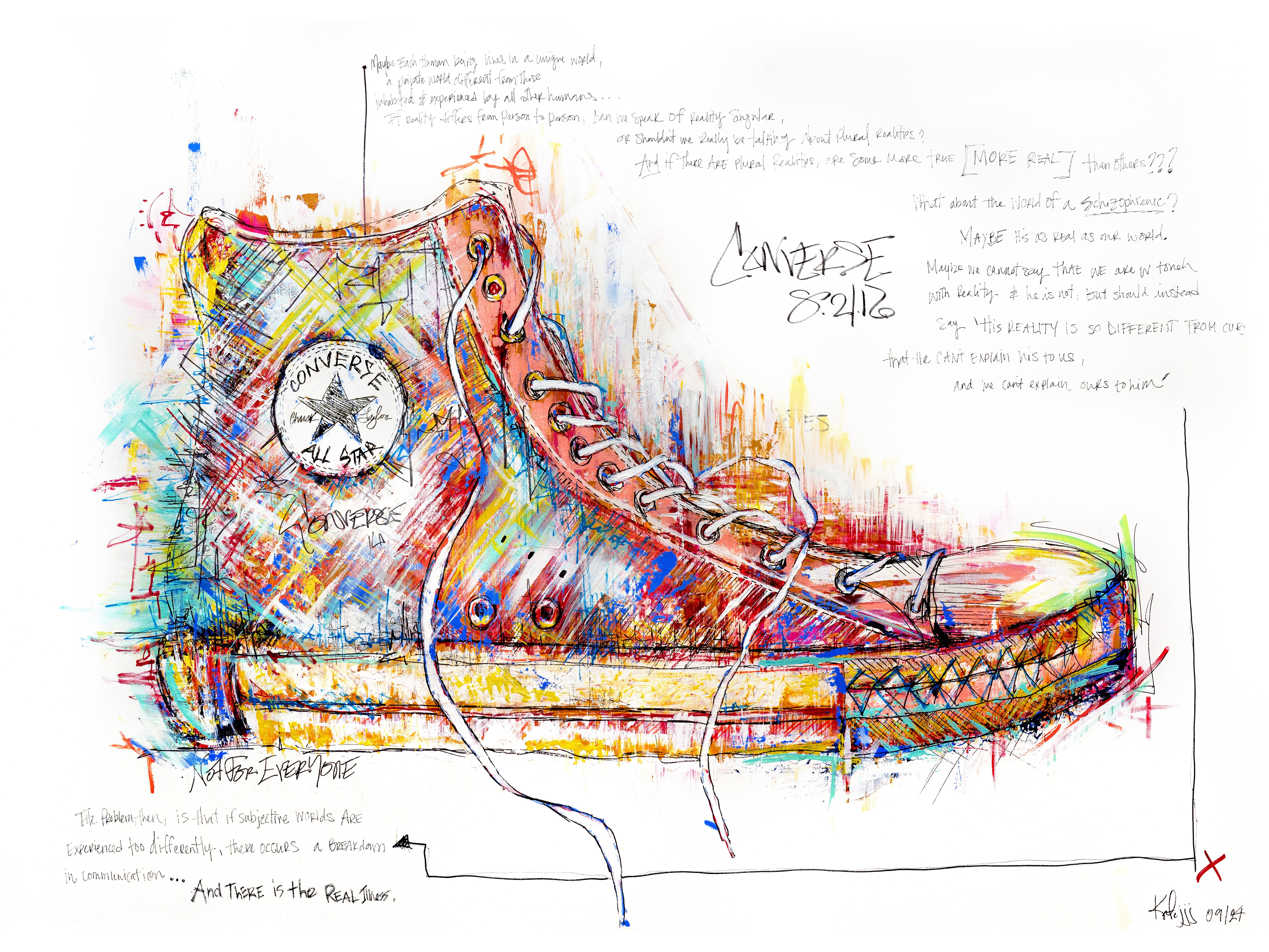
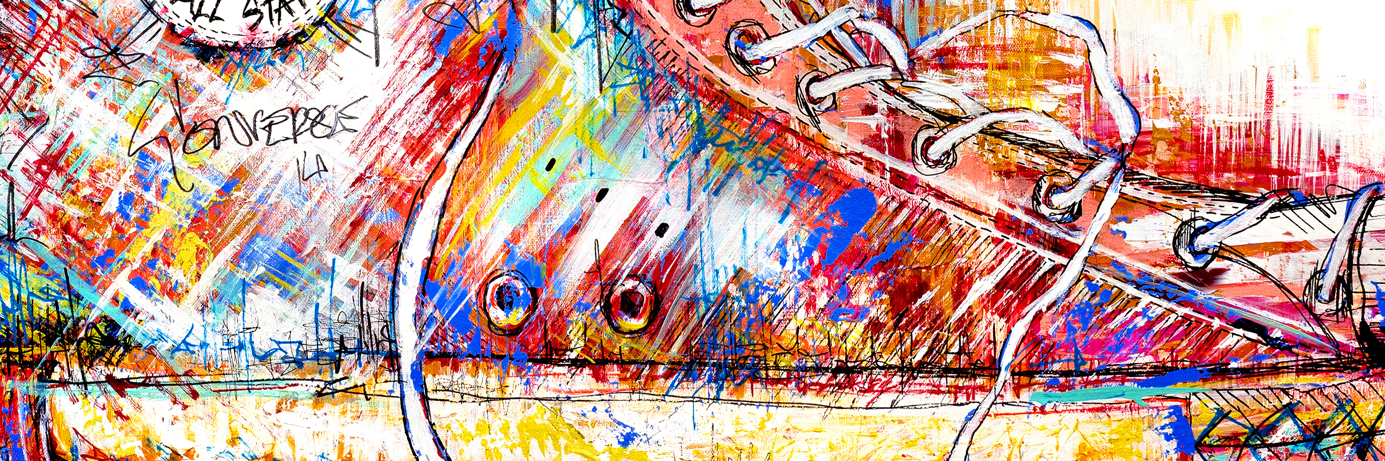
CONVERSE
This is the painting that kickstarted it all. And it was actually supposed to be just a simple 8 1/2 x 11 sketch that my roommate wanted me to make for her. Quickly this escalated to us at Blick buying a huge canvas and me over the moon excited by the vision I had for it. I’ll never forget the feelings I experienced while painting this; frustration, passion, anger that I couldn’t get it right, and then absolute ecstasy when it all came together even better than I had imagined. (A pattern of emotions that has happened with every sneaker after.) In all of my work, especially in the recent years, I really explore the different internal worlds that we all have. Even my painting style is directly derived from my own internal world when I listen to / see music, so the words I found to put on this canvas have been something I come back to time after time. And it’s a quote from Philip K. Dick:
“Maybe each human being lives in a unique world, a private world different from those inhabited and experienced by all other humans… if reality differs from person to person, can we speak of reality singular, or shouldn’t we really be talking about plural realities? And if there are plural realities, are some more true (more real) than others? What about the world of a schizophrenic? Maybe it’s as real as our world. Maybe we cannot say that we are in touch with reality and he is not, but should instead say, his reality is so different from ours that he can’t explain his to us, and we can’t explain ours to him. the problem, then, is that subjective worlds are experienced too differently, there occurs a breakdown in communication… and there is the real illness.”


Lots of penwork & a quote from a doctor about reality & mental illness.